| Slideshow ^ |< << Slide 13 of 14 >> >| |
Visualization: slice-based using sliceview-sess
In Slice-based visualization, the results are displayed on 2D slices of the braineither individual slices or mosaics of slices. To see the individual results for any subjects in your study for a single slice, you would run sliceview-sess from your Study Directory with the following options:
-slice slicenumber |
number of the slice to view |
-analysis |
analysisname name of analysis from mkanalysis-sess.new (Step 7) |
-contrast |
contrastname name of contrast from mkcontrast-sess (Step 9) |
-map |
mapname name of map made in Step 10 (sig, t, minsig, iminsig) |
-sf |
sessid from Step 3 |
-df |
sesspar from Step 3 |
To view Berts slices as a mosaic, go to your Study Directory and type:
sliceview-sess contrast omnibus analysis sem_assoc sf sessid df sesspar map fsig slice mos nohdr
(If you were running this on multiple subjects, the results for each subject will be displayed sequentially, i.e., you must close the window for one subject before you can see the next).
Sliceview Operation
Sliceview is one way of visualizing the statistical maps you generated with FS-FAST. Actually a front-end for a program called yakview, it can display maps laid over T1 or T2 structural images (slices or mosaics of slices), and can also display the average hemodynamic changes in response to different event types. When sliceview is run, it immediately brings up an image window displaying the structural and overlay slices. The base image (or underlay) is the average functional image. The overlay is the significance of the F-test. Details on how to operate the viewer follow in Sliceview Operation. Note: If you wanted to view motion corrected data, you would add the flag -motioncor. If the functional subdirectory were not named bold then you would use the fsd flag to specify the name. The raw and fsd flags can be used at the same time with analysis, -contrast, and map flags to simultaneously view raw time courses, hemodynamic responses, and statistical maps.
OUTPUT: On the next page is Sliceview showing the initial mosaic we get for Bert:

Color indicates significances in the range of 2 (i.e. 102) to 7 (i.e. 107). The red/yellow scale indicates activations above baseline. The blue scale indicates activations below baseline.
Other maps (e.g. f, sig, minsig, iminsig) can be viewed by changing the map option. For the omnibus test, only the fsig is relevant. If you want to view only a single slice, use slice SLICENO, where SLICENO is the zero-based slice number. For event-related studies the hemodynamic response for each condition can be viewed by clicking on a particular voxel in the slice. Alternatively, the nohdr option tells sliceview not to load the hemodynamic response. For more information, see the upcoming section Viewing the Hemodynamic Response.
No information about the volume is available. The slices are defined as those in the native functional space. Typically, a significance map from a particular contrast is brought to a specified threshold and laid over a structural slice.
Viewing: The minimum and maximum thresholds are set when invoking sliceview by using the themin and thmax options. Clicking with the mouse on a voxel will cause the voxel location and overlay value to be printed above the image. The voxel selected by the mouse is referred to as the current voxel. The various functions of sliceview are controlled by hitting keys when the sliceview window is open. Hitting h brings up a help menu of control keys:

Image Status Bar: The status bar is just above the image (this may not be visible during zoom). The first set of numbers gives the index of the current voxel in the structural image. The second set gives the index in the map. The third number is the value of the map at the current voxel. On the right side of the image, the fields show the current plane, sign of the tail, and the range of values for the color scale:

Image Control Keys: Initially, only the positive tails will be displayed in a red-yellow color scale. Hitting t will shift to the negative tails in a blue color scale:

Hitting t again will show both positive and negative tails in a red-yellow scale:

Hitting t again brings it back to positive only:

Viewing Berts hemodynamic responses
Berts hemodynamic responses could have been viewed with the omnibus contrast, but it is more instructive to view them using an all-versus-baseline overlay. First, create the contrast by running the following in your Study Directory:
mkcontrast-sess analysis sem_assoc contrast allvbase a 1 a 2 a 3 a 4 c 0
Note that this is similar to the omnibus created in Step 9, except that it does not include the nosumconds flag. This means that the contrast will sum the conditions together, whereas the omnibus tests each condition separately. The omnibus and all-v-baseline generally paint the same picture, but all-v-baseline allows for some more sophisticated display options.
To compute the contrast maps, type:
stxgrinder-sess contrast allvbase analysis sem_assoc sf sessid df sesspar
To view the contrast maps, type:
sliceview-sess contrast allvbase analysis sem_assoc sf sessid df sesspar map sig slice mos
Note that the nohdr flag has been removed. This forces the hemodynamic averages to be displayed (the loading can take a while). Also, the map is now sig instead of fsig, meaning that you are about to view the par-poststimulus-delay t-significance maps.
When the slices are displayed in the image window, you will not see much activation, which is fine, because you are looking at the map of the activation 4 seconds before stimulus onset:

Click in the window and press <g>. This will bring up another window with four plots:

Each plot represents the unbiased hemodynamic response to each of the four conditions at the voxel selected in the image window. As you click in the image window, you will change the time courses in this plot window. Click in the plot window and hit <e>; this will display the standard error bars for each condition at each time point:

Click in the image window and hit <+>. This will advance the map form that of 4 seconds before stimulus onset to 2 seconds before stimulus onset. You will also see a vertical line in the post-stimulus delay you are currently viewing. Hitting <+> again will advance to the next frame thus allowing you to view the activation like a movie:

HDR Status Bar
There is a series of text fields just above the HDR plot that indicates the current status of the window:
- The first field contains a series of numbers (and possible asterisks) that indicate which
conditions are currently being displayed.
- The next field is either Yfree or Yhold. Yfree: indicates the y-axis will scale the data.
- The field is either BLFree or BLZero indicating whether the pre-stimulus baseline has
been zeroed.
- The next two fields indicate the index of the current voxel.
- The next field will be either blank or % to indicate whether percent baseline is being viewed.
- Finally, the last field gives the baseline (or offset) value at the current voxel.
HDR Control Keys
Pressing h when the HDR window is active will bring up a HELP menu with the available control keys and a short description of what they do.
Pressing a number key will toggle the display of that condition (unviewed conditions have an asterisk in their status field).
Pressing e will toggle the display of standard error bars.
Pressing p will toggle display of percent signal change.
Pressing y will toggle whether the y-axis will change with the data (Yfree) or stay fixed at the current range (Yhold).
Pressing v will save the plot values to an ascii file.
A Contrast-of-Interest
Up to this point, you have only been looking at task-vs-nothing contrasts which, while useful, are not particularly interesting. The contrast-of-interest will compare the response to two tasks, loosely related with four words (L4) versus highly related with two words (H2). Here is the command to use for Bert:
mkcontrast-sess analysis sem_assoc contrast L4vH2 a 4 c 1 sumdelays
Using -a 4 c 1 means that positive values indicate that L4 is greater than H2. Normally, a separate t-test is done at each poststimulus delay. However, the sumdelays flag indicates that the statistical test should be done after summing the hemodynamic responses across poststimulus delays. This can help bring out activation when the responses to two conditions are similar but one is slightly and consistently larger than the other over time. To compute Berts contrast, type the following in your Study Directory:
stxgrinder-sess contrast L4vH2 sf sessid df sesspar
And to view the contrast, type:
sliceview-sess contrast L4vH2 analysis sem_assoc sf sessid df sesspar map sig slice mos
In the ninth slice, you should see a small patch of activation in the posterior portion of the left inferior prefrontal cortex (LIPC). In the thirteenth slice, you should see a small patch of activation in the anterior portion of the LIPC. A snapshot appears on the next page.

Note that the images are in radiological convention, so the activity of the left hemisphere will appear on the right side of the image.
Also note that it is not possible to scroll through the different post-stimulus delays because they have all been collapsed into one image.
Viewing the Functional Results on the Anatomical Volume
In the section sliceview.sec, we showed how to view the functional results overlaid on the original functional slices. In this section we show how to view the functional results on the high-resolution T1 anatomical volume. Here is the command to type from your Study Directory:
tkmedit-sess sf sessid df sesspar a sem_assoc c omnibus map fsig
You should see activation in the posterior LIPC at approximately talairach coordinates (-54, 16, 28). You should see activation in the anterior LIPC at approximately talairach coordinates (-58, 12, 2). There should also be activation in the visual and motor cortices.

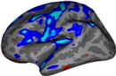
Visualization: surface-based using paint-sess and surf-sess
Surface-based visualization allows you to view the results of the functional analysis on the cortical surface (from the reconstructed data set that you downloaded in step 1). This surface can be folded, inflated, or flattened. The visualization requires two stages: painting: and surfing. Painting is the process of converting from native (Cartesian) space to cortical surface space. Surfing is the process of viewing the results on the surface. Note that these same programs (with different options) are used to view group-averaged results. To run each program, you must be in your Study Directory.
First, to paint, type the following:
paint-sess sf sessid df sesspar a sem_assoc c omnibus map fsig
Then, to view Bert's functional results on the inflated surface, type:
surf-sess sf sessid df sesspar a sem_assoc c omnibus map fsig

| Slideshow ^ |< << Slide 13 of 14 >> >| |