QML Rectangle Element
The Rectangle item provides a filled rectangle with an optional border. More...
Inherits Item
Properties
- border.color : color
- border.width : int
- color : color
- gradient : Gradient
- radius : real
- smooth : bool
Detailed Description
Rectangle items are used to fill areas with solid color or gradients, and are often used to hold other items.
Appearance
Each Rectangle item is painted using either a solid fill color, specified using the color property, or a gradient, defined using a Gradient element and set using the gradient property. If both a color and a gradient are specified, the gradient is used.
You can add an optional border to a rectangle with its own color and thickness by settting the border.color and border.width properties.
You can also create rounded rectangles using the radius property. Since this introduces curved edges to the corners of a rectangle, it may be appropriate to set the smooth property to improve its appearance.
Example Usage

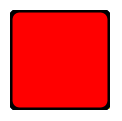
The following example shows the effects of some of the common properties on a Rectangle item, which in this case is used to create a square:
 import QtQuick 1.0

 Rectangle {
     width: 100
     height: 100
     color: "red"
     border.color: "black"
     border.width: 5
     radius: 10
 }
Performance
Using the smooth property improves the appearance of a rounded rectangle at the cost of rendering performance. You should consider unsetting this property for rectangles in motion, and only set it when they are stationary.
See also Image.
Property Documentation
The width and color used to draw the border of the rectangle.
A width of 1 creates a thin line. For no line, use a width of 0 or a transparent color.
Note: The width of the rectangle's border does not affect the geometry of the rectangle itself or its position relative to other items if anchors are used.
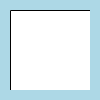
If border.width is an odd number, the rectangle is painted at a half-pixel offset to retain border smoothness. Also, the border is rendered evenly on either side of the rectangle's boundaries, and the spare pixel is rendered to the right and below the rectangle (as documented for QRect rendering). This can cause unintended effects if border.width is 1 and the rectangle is clipped by a parent item:

 Rectangle {
     width: 100; height: 100
     color: "lightblue"

     Rectangle {
         anchors.fill: parent
         anchors.margins: 10
         clip: true

         Rectangle {
             anchors.fill: parent
             border.width: 1
         }
     }
 }
Here, the innermost rectangle's border is clipped on the bottom and right edges by its parent. To avoid this, the border width can be set to two instead of one.
color : color |
This property holds the color used to fill the rectangle.
The default color is white.

The following example shows rectangles with colors specified using hexadecimal and named color notation:
 Rectangle {
     color: "#00B000"
     width: 80; height: 80
 }

 Rectangle {
     color: "steelblue"
     y: 100; width: 80; height: 80
 }
If both a gradient and a color are specified, the gradient will be used.
See also gradient.
gradient : Gradient |
The gradient to use to fill the rectangle.
This property allows for the construction of simple vertical gradients. Other gradients may by formed by adding rotation to the rectangle.

 Rectangle {
     y: 0; width: 80; height: 80
     color: "lightsteelblue"
 }

 Rectangle {
     y: 100; width: 80; height: 80
     gradient: Gradient {
         GradientStop { position: 0.0; color: "lightsteelblue" }
         GradientStop { position: 1.0; color: "blue" }
     }
 }

 Rectangle {
     y: 200; width: 80; height: 80
     rotation: 90
     gradient: Gradient {
         GradientStop { position: 0.0; color: "lightsteelblue" }
         GradientStop { position: 1.0; color: "blue" }
     }
 }
If both a gradient and a color are specified, the gradient will be used.
radius : real |
This property holds the corner radius used to draw a rounded rectangle.
If radius is non-zero, the rectangle will be painted as a rounded rectangle, otherwise it will be painted as a normal rectangle. The same radius is used by all 4 corners; there is currently no way to specify different radii for different corners.
smooth : bool |
Set this property if you want the item to be smoothly scaled or transformed. Smooth filtering gives better visual quality, but is slower. If the item is displayed at its natural size, this property has no visual or performance effect.
Note: Generally scaling artifacts are only visible if the item is stationary on the screen. A common pattern when animating an item is to disable smooth filtering at the beginning of the animation and reenable it at the conclusion.

On this image, smooth is turned off on the top half and on on the bottom half.