Intro to Qt Quick
Overview
QML is a high level, scripted language. Its commands, more correctly elements, leverage the power and efficiency of the Qt libraries to make easy to use commands that perform intuitive functions. Draw a rectangle, display an image at a position and so on. Behind these elements are complex C++ libraries that efficiently perform the action. As with any graphical application, always consider that this ability to easily build graphically rich applications means that some care may be needed to prevent performance problems.
The language also allows more flexibility of these commands by using Javascript rather than C++ to add new layers of logic to your application. Javascript is easier to learn than C++ and can be embedded into the QML files or imported from a separate file.
In QML the types of various 'objects' are referred to as elements.
An element usually has various properties that help define the element. For example, if we created an element called Circle then the radius of the circle would be a property.
A First Look
The basic syntax of an element is
 SomeElement {
     id: myObject
     ... some other things here ...
 }
Here we are defining a new object. We specify its 'type' first as SomeElement. Then within matching braces { ... } we specify the various parts of our element.
The id is a unique identifier for the element, it must start with a lower case letter and only contain letters, numbers and underscores. It is this particular object's name. If this SomeElement element was a Rectangle instead and it was one of many then the optional unique id would allow us to manipulate each element individually.
Each visual element is ultimately based on, or inherits from, an element called Item. Item has certain properties and actions that may be useful. The properties have default values so you need only specify the ones you will need.
Take a simple element such as a Rectangle. It has an id, we will call it myRectangle, it has a width and a height. Imagine that we want a rectangle that is 500 pixels by 400 pixels in the x and y directions (horizontal by vertical).
We can implement this Rectangle with these properties this way
 import QtQuick 1.0

 // This is a comment. And below myRectangle is defined.
 Rectangle {
     id: myRectangle
     width: 500
     height: 400
 }
This is a valid QML script. To run it, copy it and save it to a file, say myexample.qml, and on the command line run the following command:
qmlviewer myexample.qml
On Mac OS X, open the "QMLViewer" application instead and open the myexample.qml file, or run it from the command line:
QMLViewer.app/Contents/MacOS/QMLViewer myexample.qml
It will create a very boring rectangle in its own window.
Hello World!
We can now add some color and text to make a Hello World QML program.
Rectangle has the property color to produce a background color.
Text is handled by a different element called Text. We need to create a Text object inside the Rectangle and set its text property to "Hello World!". So to set the text to "Hello world" and the background colour to light gray,
 import QtQuick 1.0

 Rectangle {
     id: myRectangle
     width: 500
     height: 400

     Text { text: "Hello World!" }

     color: "lightgray"
 }
Hello World Again
From now on we will not always show the import statement for Qt but it should still be there when you create your QML scripts.
To make our Hello World example a little nicer set the position of the text to be at pixel position x = 100, y = 100 within the displayed window. This position belongs to the Text element so we set the position inside its definition. Note that we separate different QML statements on the same line with a semi-colon, or we could have simply put each statement on a new line
     Text {
         text: "<h2>Hello World</h2>"; color: "darkgreen"
         x: 100; y:100
     }
Not only did we reposition the text, but the text was altered by adding HTML tags to change the font size. The text color was also changed from the default black to dark green by using a standard string for the color's SVG name.
We could also have used a hexadecimal string for the RGB (red-green-blue, as #rrggbb) values of the color similar to the method used in HTML. For example, mostly blue with a green tint,
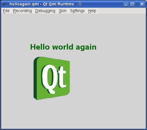
     Text {
         text: "<h1>Hello world again</h1>"
         color: "#002288"
         x: 100; y: 100
     }
All of these changes occurred within the Text object which is the scope of these property changes.
Other objects may use the information but it belongs to the element where the property has been defined.
Images
To add an image to our little application we use the Image element. An Image uses a path to an image file, and has properties to control the aspect ratio, the image size, to tile the area amongst others. The source of the image, the path to the file, is a URL. Therefore the file can be local: mydir/myimage1.png. Or it can be remote: "http://www.example.com/images/myimage1.png".
     Image {
         source: "images/qt-logo.svg"
     }
This displays the image, as we would expect, at the top left of the window. The position of the default x = 0, y = 0 coordinate. The example here uses a PNG file, but it could have been one of various supported formats, including JPG and GIF.
Let us reposition the image and enlarge it. Place it at the same 'x' offset as the "Hello world again" text, but put it another 50 pixels below the text, also make it 150 by 150 pixels in size,
     Image {
         source: "images/qt-logo.svg"
         x: 100; y: 150
         width: 150; height: 150
     }
Adding the Hello World example, with the text and the image example we can write a simple piece of QML that starts to look a bit better.
 import QtQuick 1.0

 Rectangle {
     id: myRectangle
     width: 500
     height: 400

     Text {
         text: "<h1>Hello world again</h1>"
         color: "#002288"
         x: 100; y: 100
     }

     Image {
         source: "images/qt-logo.svg"
         x: 100; y: 150
         width: 150; height: 150
     }

     color: "lightgray"
 }
The result is still quite simple
Anchors: Aligning Elements
Using absolute positioning, such as saying x = 100 and y = 150, works well until the user or developer stretches or increases the size of the window. Then the positions need to be recalculated. What would be nice would be a relative means of positioning of objects in a window or rectangle. For example, we want to place an image at the bottom of a rectangle, we would like to specify the image's location as the 'bottom of the window', not a specific coordinate. We can do this with the anchors property, which objects inherit from Item.
The anchors property is really a property group. It is a collection of related properties. It has properties within it which can be used by means of the dot notation.
The dot notation uses object ids and property names to use a particular object or property. Say I have a rectangle r1, which contains a rectangle r2, which contains an Item item1, which has an 'x' property I want to change. I just use the dot notation to identify it: r1.r2.item1.x
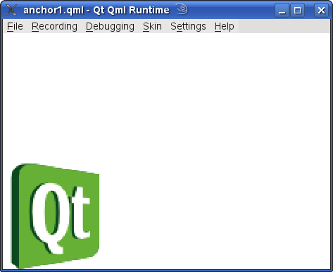
If we want to position an image at the bottom of the rectangle it is inside. I have to specify that the bottom of the image is also at the bottom of the rectangle
 import QtQuick 1.0

 Rectangle {
     id: myWin
     width: 500
     height: 400

     Image {
         id: image1
         source: "images/qt-logo.svg"
         width: 150; height: 150
         anchors.bottom: myWin.bottom
     }
 }
This places the logo at the bottom left of the window.
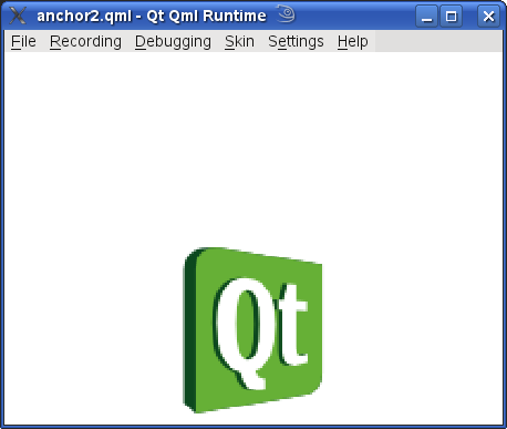
We would like it centered and not touching the bottom of the window, for aesthetic reasons. For the centering we use the horizontalCenter property, and to prevent the touching of the image to the bottom of the rectangle, the bottomMargin property is used. So the new actions for the script are
- set the bottom of the image (anchors.bottom) to be the bottom of the window
- move the image to be in the horizontal center of the window
- set a margin of 10 pixels so that the image does not touch the bottom window border
Encoded into QML the script becomes
 import QtQuick 1.0

 Rectangle {
     id: myWin
     width: 500
     height: 400

     Image {
         id: image1
         source: "images/qt-logo.svg"
         width: 150; height: 150
         anchors.bottom: myWin.bottom
         anchors.horizontalCenter: myWin.horizontalCenter
         anchors.bottomMargin: 10
     }
 }
Run this and resize the window. You will see that now the position of the image adjusts during the resize.
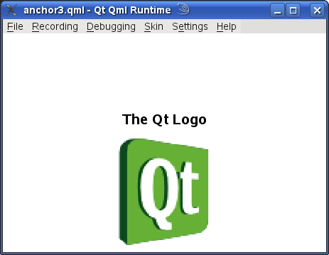
You can also add another object say a block of descriptive text and place it above or below the image or to the side. This code places some text just above the image
     Text {
         text: "<h2>The Qt Logo</h2>"
         anchors.bottom: image1.top
         anchors.horizontalCenter: myWin.horizontalCenter
         anchors.bottomMargin: 15
     }
Note: anchors is a property group, to be used within the object. When referencing these properties from another object we use the property directly, instead of saying:
myRectangle.anchors.top // Wrong
we use
myRectangle.top // Correct
Transformations
We can transform a graphical object to get additional effects. Rotate a piece of text by 180 degrees to display upside-down text. Rotate an image by 90 degrees to lay it on its side. These transformations require additional information.
For rotation, the additional information includes: the origin relative to the object being rotated, the axis of rotation, and the angle in degrees to rotate the image through in a clockwise direction. The axis does not have to be the z-axis, the line between your eyes and the image, it could be along the vertical y-axis or the horizontal x-axis. We have three dimensions to play with. For simplicity in this example we will rotate about the z-axis by 90 degrees in a negative direction, anti-clockwise.
Rotation of text was also suggested. It could also be useful to scale the text. We can do both. The transform property is a list of Transform elements, so using the list syntax
myList: [ listElement1, listElement2, ... } ]
we can produce a list of transformations.
The text will be rotated by 45 degrees anti-clockwise and scaled vertically by a factor of 1.5 and by 1.2 horizontally.
Using the example above as the basis for this we have,
 import QtQuick 1.0

 Rectangle {
     id: myWin
     width: 500
     height: 400

     Image {
         id: image1
         source: "images/qt-logo.svg"
         width: 150; height: 150
         anchors.bottom: myWin.bottom
         anchors.horizontalCenter: myWin.horizontalCenter
         anchors.bottomMargin: 10

         transform: Rotation {
             origin.x: 75; origin.y: 75
             axis{ x: 0; y: 0; z:1 }  angle: -90
         }

     }

     Text {
         text: "<h2>The Qt Logo -- taking it easy</h2>"
         anchors.bottom: image1.top
         anchors.horizontalCenter: myWin.horizontalCenter
         anchors.bottomMargin: 15

         transform: [
             Scale { xScale: 1.5; yScale: 1.2 } ,

             Rotation {
                 origin.x: 75; origin.y: 75
                 axis{ x: 0; y: 0; z:1 }  angle: -45
             }
         ]
     }
 }
The code block in image1 starting with transform specifies that the transform property will be a Rotation through -90 degrees, which is anti-clockwise, about the z-axis running through the center of the image at (75,75), since the image is 150 x 150 pixels.
The other transformation available is Translate. This produces a change in position of the item.
Note: In a list of transformations the order of the transformations is important. In the above example try swapping around the Scale transform with the Rotation transform, remember to remove or add the comma. The results are acceptable for our little test but not the same.
Animations
Animation in QML is done by animating properties of objects. Properties that are numbers, colors, Rectangles, points and directions. In QML these are QML Basic Types named as real, int, color, rect, point, size, and vector3d. There are a number of different ways to do animation. Here we will look at a few of them.
Number Animation
Previously we have used a rotation transformation to change the orientation of an image. We could easily animate this rotation so that instead of a straight rotation counter-clockwise of 90 degrees we could rotate the image through a full 360 degrees in an animation. The axis of rotation wont change, the position of the center of the image will not change, only the angle will change. Therefore, a NumberAnimation of a rotation's angle should be enough for the task. If we wish for a simple rotation about the center of the image then we can use the rotation property that is inherited from Item. The rotation property is a real number that specifies the angle in a clockwise direction for the rotation of the object. Here is the code for our animated rotating image.
 import QtQuick 1.0

 Rectangle {
     id: mainRec
     width:  600
     height: 400

     Image {
         id: image1
         source: "images/qt-logo.svg"
         x: 200; y: 100
         width: 100; height: 100

         // Animate a rotation
         transformOrigin: Item.Center
         NumberAnimation on rotation {
             from: 0; to: 360
             duration: 2000
             loops: Animation.Infinite
         }
     }
 }
The transformOrigin: Item.Center is redundant since this is the default axis of rotation anyway. But if you change Center to BottomRight you will see an interesting variation.
Also if instead the Rotation transformation had been used then we would have more control over the various parameters. We could vary the axis, to be not just a different offset from the z-axis but along the y-axis, x-axis or combination. For example, if the task had been to animate the rotation about the y-axis passing through the center of the image then the following code would do it.
 import QtQuick 1.0

 Rectangle {
     id: mainRec
     width:  600
     height: 400

     Image {
         id: image1
         source: "images/qt-logo.svg"
         x: 200; y: 100
         width: 100; height: 100

         // Animate a rotation
         transform: Rotation {
             origin.x: 50; origin.y: 50; axis {x:0; y:1; z:0} angle:0
             NumberAnimation on angle  {
                 from: 0; to: 360;
                 duration: 3000;
                 loops: Animation.Infinite
             }
         }
     }
 }
Here there is a rectangle 600 by 400 pixels. Placed within that rectangle is an image 100 by 100 pixels. It is rotated about the center of the image about the y-axis so that it looks as if it is rotating about an invisible vertical string holding it up. The time it takes to complete the rotation is 3 seconds (3,000 milliseconds). The NumberAnimation is applied to the angle taking it from 0 (no change) to 360 degrees, back where it started. Strictly speaking it isn't necessary to go from 0 to 360 since the same location is duplicated, but it makes it easier to read in this example and it has no visible effect on the animation. The number of loops that the animation will execute is set to Animation.Infinite which means that the animation is in an endless loop.
To see an interesting variation. Change the axis to axis { x:1; y:1; z:1 }. This is a line coming from the center of the image downwards to the right and out of the screen. Although the change is simple the rotation seems complex.
Sequential Animation
For a more complex animation we will need two images. The first image will be placed at the center of a window (Rectangle) and the second image will be at the upper left of the window. The animation will move the second image from the top left of the window to the bottom right. In doing so we will be animating the position and the size of the image.
First create two images
 import QtQuick 1.0

 Rectangle {
     id: mainRec
     width:  600
     height: 400
     z: 0

     Image {
         id: image1
         source: "images/qt-logo.svg"
         x: 20; y: 20 ; z: 1
         width: 100; height: 100
     }

     Image {
         id: image2
         source: "images/qt-logo.svg"
         width: 100; height: 100
         x: (mainRec.width - 100)/2; y: (mainRec.height - 100)/2
         z: 2
     }
 }
We will add to 'image1' a SequentialAnimation from x = 20 to the target of x = 450. The 'from' values will be used because we will be repeating the animation, so the object needs to know where the original position is, both x and y. The SequentialAnimation of x will set it to repeat by indicating that the number of animation loops is infinite, meaning that the 'loop' counter will be set to a value Animation.Infinite that indicates an endless cycle. Also there will be a NumberAnimation to vary the numeric property between the x values and over a given duration. After the NumberAnimation there will be a PauseAnimation that will pause the animation for 500 milliseconds (half a second) simply for the visual effect.
     Image {
         id: image1
         source: "images/qt-logo.svg"
         width: 100; height: 100

         SequentialAnimation on x {
             loops: Animation.Infinite
             NumberAnimation {
                 from: 20; to: 450; easing.type: "InOutQuad";
                 duration: 2000
             }
             PauseAnimation { duration: 500 }
         }
     }
A similar block of code is written for the animation of the 'y' value of the position.
We will also animate the scale of the object, so as it goes from top left to bottom right of the window it will become smaller until about midway, and then become larger. To complete the animation we will set the 'z' values of the images. 'z' is the stacking order, the z-axis effectively points out from the screen to your eyes with the default value of 'z' being 0. So if we set the Rectangle to have z with value zero, just to be sure, and image1 to 1 and image2 to 2 then image2 will be in the foreground and image1 in the background. When image1 passes image2 it will pass behind it. The completed code looks like
 import QtQuick 1.0

 Rectangle {
     id: mainRec
     width:  600
     height: 400
     z: 0

     Image {
         id: image2
         source: "images/qt-logo.svg"
         width: 100; height: 100
         x: (mainRec.width - 100)/2; y: (mainRec.height - 100)/2
         z: 2
     }

     Image {
         id: image1
         source: "images/qt-logo.svg"
         x: 20; y: 20 ; z: 1
         width: 100; height: 100

         SequentialAnimation on x {
             loops: Animation.Infinite
             NumberAnimation {
                 from: 20; to: 450
                 easing.type: "InOutQuad"; duration: 2000
             }
             PauseAnimation { duration: 500 }
         }

         SequentialAnimation on y {
             loops: Animation.Infinite
             NumberAnimation {
                 from: 20; to: 250
                 easing.type: "InOutQuad"; duration: 2000
             }
             PauseAnimation { duration: 500 }
         }

         SequentialAnimation on scale {
             loops: Animation.Infinite
             NumberAnimation { from: 1; to: 0.5; duration: 1000 }
             NumberAnimation { from: 0.5; to: 1; duration: 1000 }
             PauseAnimation { duration: 500 }
         }
     }
 }
The easing.type has many options, expressed as a string. It specifies the kind of equation that describes the acceleration of the property value, not necessarily position, over time.
For example, InOutQuad means that at the start and the end of the animation the 'velocity' is low but the acceleration or deceleration is high. Much like a car accelerating from stop, and decelerating to stop at the end of a journey, with the maximum speed being in the middle. Examine the easing documentation and the various graphs that show the effect. The horizontal axis, 'progress', can be thought of as time. The vertical axis is the value of the particular property.
In discussing animation we need to describe three objects: State, MouseArea and Signals. Although independent of the animation elements, animation delivers some of the best examples that illustrate these new elements.
Animation Summary
| Name | Description |
|---|---|
a property value on a target object is varied to a specified value over a given time. | |
animate a numeric property from one value to another over a given time. | |
results in the task waiting for the specified duration, in milliseconds. | |
allows us to list in order the animation events we want to occur, first A then B then C and so on. | |
enables us to run different animations at the same time instead of sequentially. |
Using States
A state is a defined set of values in the configuration of an object and often depends on the previous state. For example, a glass could be in a state we call 'HalfFull' if it is being filled with a liquid and has reached half of its total capacity. We could also have a state called HalfEmpty which is the state that occurs when the amount of liquid drops to half of the glass's capacity. Both states represent the same amount of liquid, but we consider them different. Likewise, states in a program represent not just values but may include how the current values were reached.
When a state changes a transition occurs. This is an opportunity to make changes or take actions that depend on the movement to the new state. For example, if we had a scene in the country where the state variable has two states "daylight" and "night". Then when the state changes to "night" at this transition the sky would be made dark, stars would be shown, the countryside would be darkened. And when the state changes to "daylight" the opposite changes would be made: the sky is now blue, the scenery is green, there is a sun in the sky.
Here is a simple QML program that shows the change of state in the above example. We have two rectangles, the top one is the 'sky' and the bottom one is the 'ground'. We will animate the change from daylight to night. There will be two states, but we only need to define one since 'daylight' will be the default state. We will just go to 'night' by clicking and holding the left mouse button down, releasing the mouse button will reverse the process
 import QtQuick 1.0

 Rectangle {
     id: mainRectangle
     width:  600
     height: 400
     color: "black"

     Rectangle {
         id: sky
         width: 600
         height: 200
         y: 0
         color: "lightblue"
     }

     Rectangle {
         id: ground
         width: 600; height: 200
         y: 200
         color: "green"
     }

     MouseArea {
         id: mousearea
         anchors.fill: mainRectangle
     }

     states: [ State {
             name: "night"
             when: mousearea.pressed == true
             PropertyChanges { target: sky; color: "darkblue" }
             PropertyChanges { target: ground; color: "black" }
         },
         State {
             name: "daylight"
             when: mousearea.pressed == false
             PropertyChanges { target: sky; color: "lightblue" }
             PropertyChanges { target: ground; color: "green" }
         }
     ]

     transitions: [ Transition {
             from: "daylight"; to: "night"
             ColorAnimation { duration: 1000 }
         },
         Transition {
             from: "night"; to: "daylight"
             ColorAnimation { duration: 500 }
         }
     ]
 }
Several new things appear in this sample. Firstly, we use a MouseArea element to detect mouse clicks in the mainRectangle. Secondly, we use the list notation [ thing1 , thing2, ... ] to build a list of states and a list of transitions.
MouseArea defines a region that will respond to mouse clicks. In this case we are only concerned with when the mouse is pressed or not pressed, not the particular button or other details. The area of the MouseArea is the entire main window, mainRectangle, so that clicking anywhere in this region will start the animation. Since we are using the 'pressed' mouse state, then the animation will move from 'daylight' to 'night' only while the mouse button remains pressed.
When the button is released the 'daylight' state is entered and the transition from 'night' to 'daylight' is triggered causing the animation to run. The transition specifies the duration in milliseconds of the ColorAnimation, while the state specifies the color of the new state.
The PropertyChanges command is the way that we nominate which properties will change in a change of state, and what new value the property will take. Since, for example, we want the 'sky' region to turn to dark blue and the 'ground' region to turn to black for the 'night' state, then the rectangles for those regions are the 'target' and the property in the target is 'color'.
Signals
Signals are simply events that can be hooked up to actions we want performed. In QML they are usually preceded by the word 'on', for example in the animation using a MouseArea the signal was onPressed. If you look at the C++ documentation you will see a lot of talk about Signals and Slots. Signals are connected to Slots. The signal represents an event and the Slot is the function that does something based on that event. You can also have Signals connected to other Signals, so that one Signal (event) triggers another Signal (event), and so forth. It is nice to know this is what happens beneath the QML layer but not essential for using QML.
Most elements do not have Signals associated with them. However, a few like the Audio element have many signals. Some of the Audio signals are used to represent events such as when the audio is stopped, play is pressed, paused, and reaching the end of the media. They allow the developer to connect, for example, the press of a user interface button (perhaps a MouseArea) to some QML that will handle this event.
Analyzing An Example: Dial Control
In the Qt examples/declarative/ui-components folder you will find a folder dialcontrol which contains the dialcontrol example.
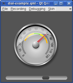
In essence this small application has a sliding bar that you can slide using a mouse, and a graphical dial that responds to the position of the slider.
The code for the example is in two parts: Dial.qml and dialcontrol.qml.
Dial.qml can be found in the content sub-directory. It defines a Dial component similar to an odometer. Eventually, the example will hook up a slider component so that moving the slider will change the position of a needle on the dial.
The code for the Dial, identified by the name of the file, contains four images in overlapping order: the background (numbers and divisions), the shadow of the needle, the needle itself, and finally the 'glass' overlay (containing transparent layers).
The needle_shadow.png image has a Rotation assigned to the transform attribute of the Image. The rotation is set to match the angle of the needle image angle value needleRotation.angle. Both the needle and the needle_shadow have the same default x and y values but the rotation origin for the needle is slightly different so that a shadow will be evident as the needle moves.
     Image {
         x: 96
         y: 35
         source: "needle_shadow.png"
         transform: Rotation {
             origin.x: 9; origin.y: 67
             angle: needleRotation.angle
         }
     }
And the needle
     Image {
         id: needle
         x: 98; y: 33
         smooth: true
         source: "needle.png"
         transform: Rotation {
             id: needleRotation
             origin.x: 5; origin.y: 65
             //! [needle angle]
             angle: Math.min(Math.max(-130, root.value*2.6 - 130), 133)
             Behavior on angle {
                 SpringAnimation {
                     spring: 1.4
                     damping: .15
                 }
             }
             //! [needle angle]
         }
     }
The final image is the overlay which simply has a position defined.
Image { x: 21; y: 18; source: "overlay.png" }
dialcontrol.qml in the examples/declarative/ui-components/dialcontrol directory is the main file of the example. It defines the visual environment that the Dial will fit into. Because the Dial component and the images live in the content sub-directory we will have to import this into dialcontrol.qml. So the start of the file looks like
 import QtQuick 1.0
 import "content"
The visual space is bound by a 300 by 300 pixel Rectangle which is given a gray color. Inside this rectangle is our component Dial and a Rectangle. Inside the rectangle called 'container' is another rectangle with the interesting name 'slider'.
 Rectangle {
     color: "#545454"
     width: 300; height: 300

     // Dial with a slider to adjust it
     Dial {
         id: dial
         anchors.centerIn: parent
         value: slider.x * 100 / (container.width - 34)
     }

     Rectangle {
         id: container
         anchors { bottom: parent.bottom; left: parent.left
             right: parent.right; leftMargin: 20; rightMargin: 20
             bottomMargin: 10
         }
         height: 16

         radius: 8
         opacity: 0.7
         smooth: true
         gradient: Gradient {
             GradientStop { position: 0.0; color: "gray" }
             GradientStop { position: 1.0; color: "white" }
         }

         Rectangle {
             id: slider
             x: 1; y: 1; width: 30; height: 14
             radius: 6
             smooth: true
             gradient: Gradient {
                 GradientStop { position: 0.0; color: "#424242" }
                 GradientStop { position: 1.0; color: "black" }
             }

             MouseArea {
                 anchors.fill: parent
                 anchors.margins: -16 // Increase mouse area a lot outside the slider
                 drag.target: parent; drag.axis: Drag.XAxis
                 drag.minimumX: 2; drag.maximumX: container.width - 32
             }
         }
     }
     QuitButton {
         anchors.right: parent.right
         anchors.top: parent.top
         anchors.margins: 10
     }
 }
The Dial component, named 'dial, is anchored to the center of the main rectangle. The value attribute of 'dial' is set to a value based on the 'slider' horizontal position and the 'container' width. So changes to the 'slider' position will change the Dial value which is used in Dial to compute the rotation of the needle image. Notice this piece of code in Dial where the change in value modifies the position of the needle.
             angle: Math.min(Math.max(-130, root.value*2.6 - 130), 133)
             Behavior on angle {
                 SpringAnimation {
                     spring: 1.4
                     damping: .15
                 }
             }
This is part of the needleRotation that rotates the needle and causes the rotation of its shadow. SpringAnimation is an element that modifies the value of that rotation angle and mimics the oscillatory behavior of a spring, with the appropriate spring constant to control the acceleration and the damping to control how quickly the effect dies away.
The 'container' is light gray with a color gradient defined using GradientStop. The gradient is applied vertically. If you need a horizontal gradient then you could apply the vertical gradient and then rotate the item by 90 degrees.
The 'slider' is dark gray and also has a vertical color gradient. The most important thing about the 'slider' is that it has a MouseArea defined, which specifies a drag.target on itself along the X-axis. With minimum and maximum values on the X-axis defined. So we can click on the 'slider' and drag it left and right within the confines of the 'container'. The motion of the 'slider' will then change the value attribute in Dial as discussed already.
Also notice the use of a radius value for a rectangle. This produces rounded corners. That is how the 'container' and 'slider' are displayed with a pleasant rounded look.